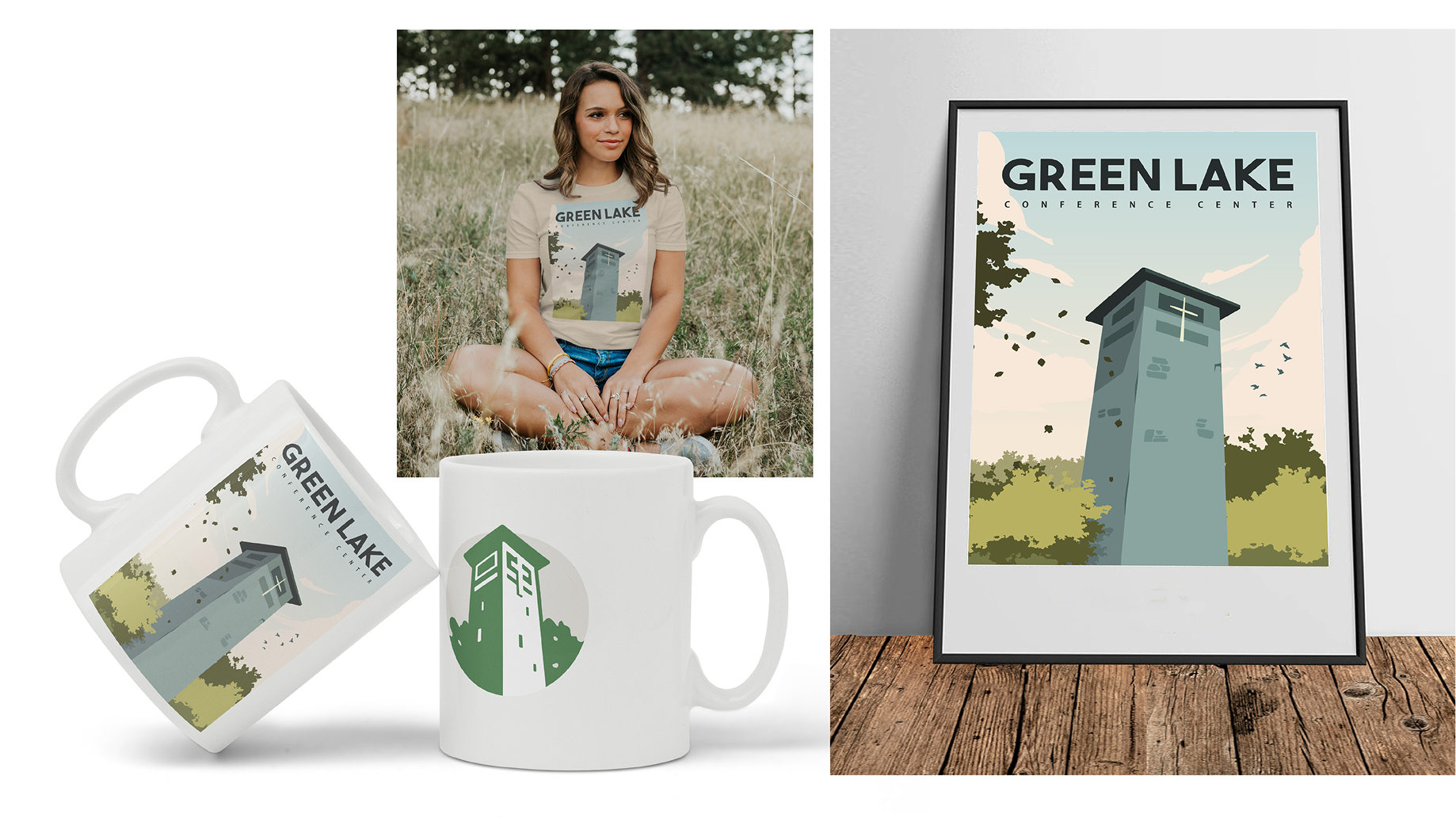
Green Lake Conference Center is a historic Wisconsin retreat where people come to reconnect—with God, nature, and themselves. But their brand wasn’t reflecting the beauty of what actually happens there. They needed a complete refresh that could honor 80+ years of history while capturing the transformative experience of the place.
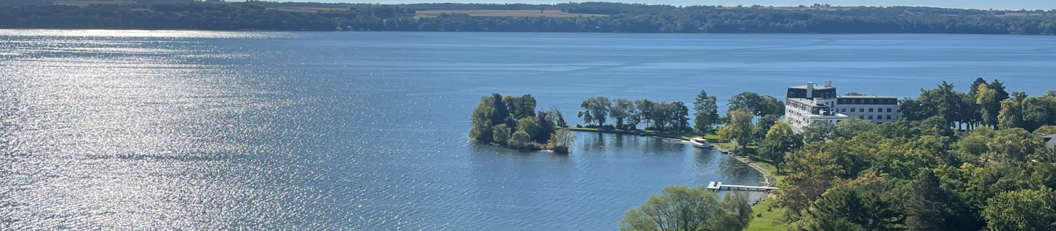
Green Lake had cycled through multiple logos over the decades, each one adding to the clutter. The current brand felt dated and disconnected from the stunning natural setting. They needed a unified identity that could work across all four Wisconsin seasons and speak to both their Christian roots and their broader mission of ReCreation—a concept that means more than just relaxation. It’s about renewal, transformation, and becoming a better version of yourself.
THE Spark
People, place, and the seasons
that shape them.
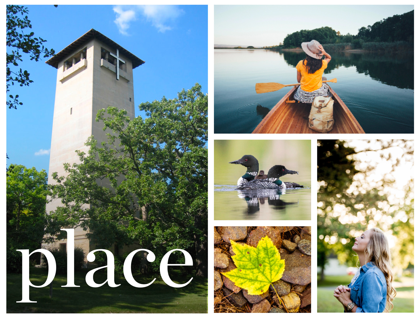
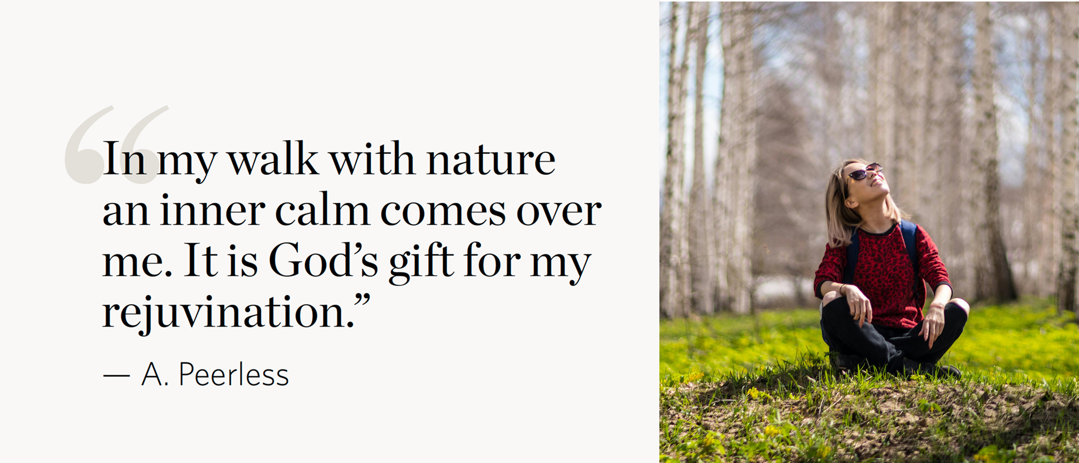
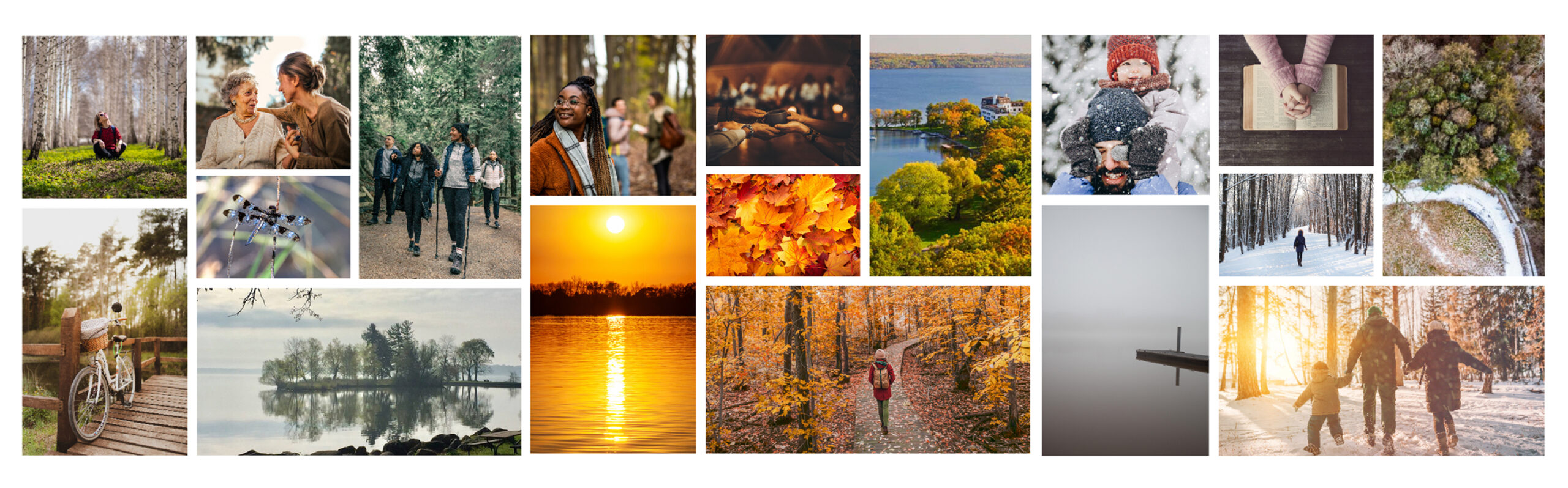
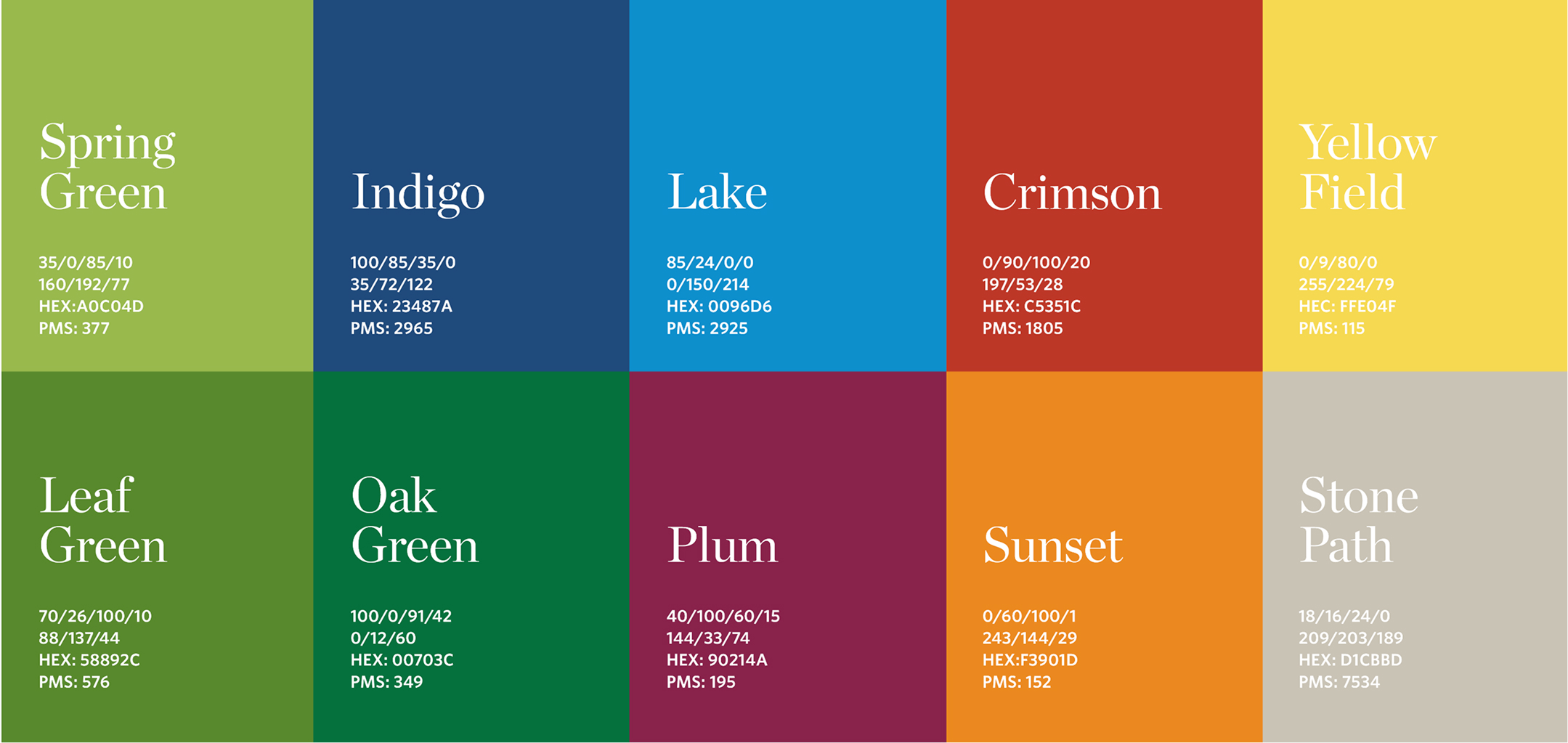
We built the brand around two core ideas: people and place. Green Lake isn’t just a location—it’s where people engage with the environment, find peace, and discover space for growth. We created a color palette pulled directly from the landscape: Oak Green, Emerald Green, Hunter Green, Leaf Green, Spring Green, Lake Blue, Indigo, Plum, Crimson, Sunset Orange, Yellow Field, and Stone Path. The photography direction emphasized “sense of place”—images that transport you there, showing people connecting with nature across all four seasons.
THE COLLABORATIVE PROCESS
A brand that breathes with
the seasons.
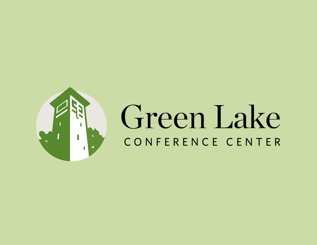
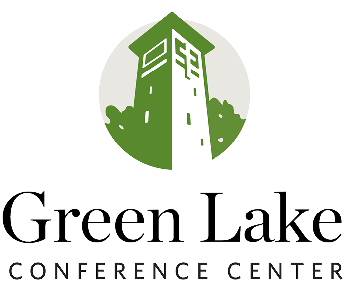
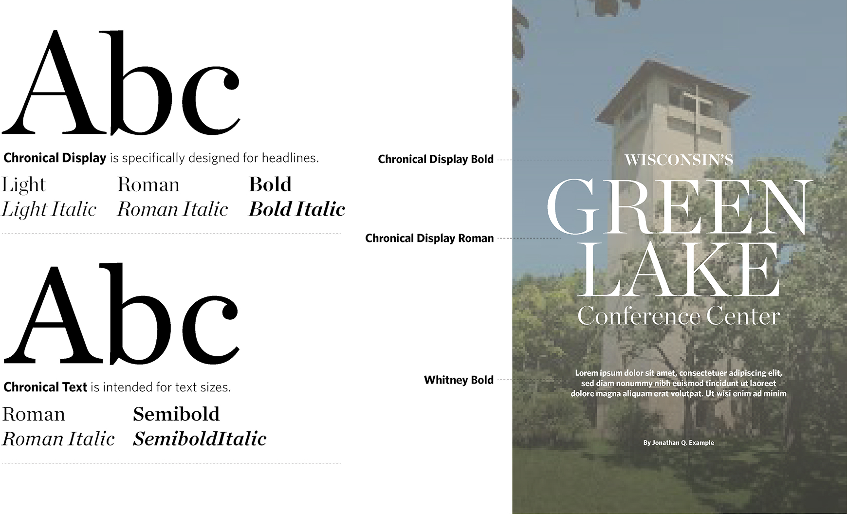
We designed a flexible identity system anchored by an iconic tower mark—the landmark that’s been at the heart of Green Lake for decades. The logo mark features the tower with surrounding trees, creating a circular emblem that feels both classic and fresh. We paired it with Chronicle Display for headlines (elegant, timeless) and Whitney for body copy (clean, modern). The result is a brand that can shift with the seasons—vibrant greens in summer, rich oranges and crimsons in fall, crisp blues and whites in winter—while always feeling cohesive.
THE Impact
A brand as beautiful as the place itself.
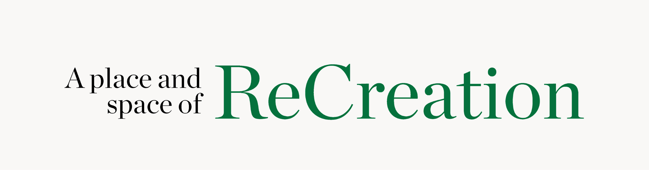
Green Lake now has a visual identity that matches the experience. The brand works seamlessly across business cards, email signatures, social media, and on-site materials. Most importantly, it captures what makes Green Lake special: it’s a place and space of ReCreation where beauty, memories, meaning, and closeness converge. The flexible color system and seasonal photography ensure the brand never feels static—it evolves with the landscape, just like the people who visit.
No pitch, no pressure. Just a 30-minute conversation to hear what you’re working on and figure out if we’re the right fit. Our founder, Joel answers every inquiry personally — because that’s how we do things, together.