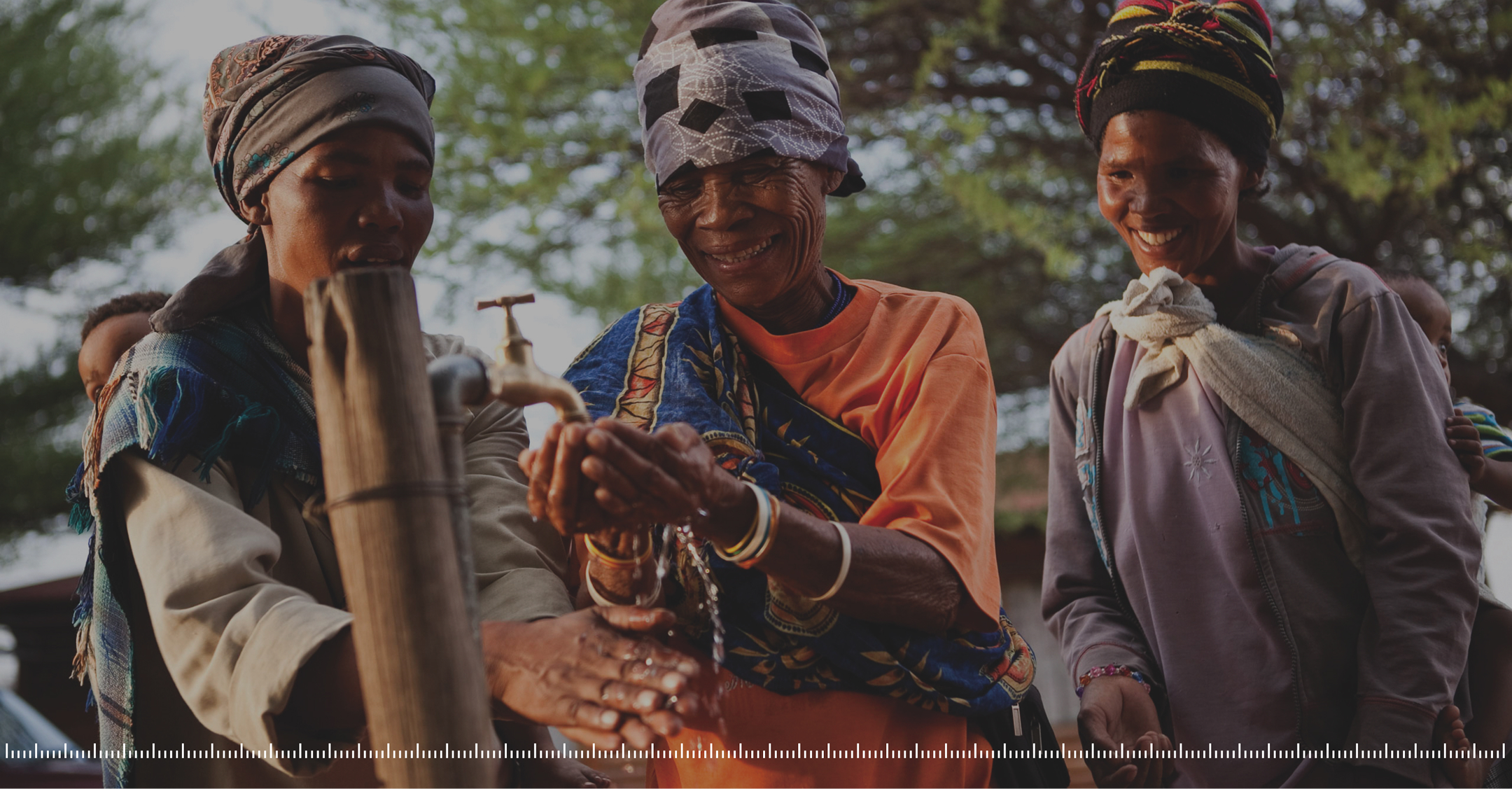
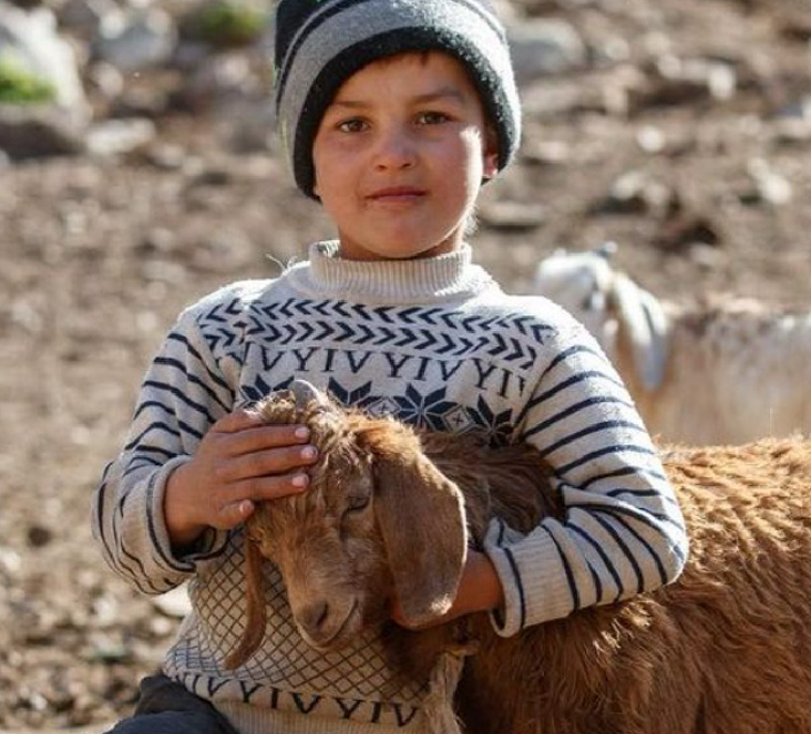
SIL translates the Bible into minority languages across 119 countries. They had a logo. They had incredible stories. They had stunning images of real communities. What they didn’t have: a brand system that could carry the weight of 90 years of impact. We built them one.
SIL is a longstanding organization doing extraordinary work—walking alongside 1,572 language communities to help them flourish. But their brand didn’t reflect that. They had no style guide. No creative consistency. Just a logo and stories that deserved better. They needed a brand system that could match the caliber of their mission.
The Spark
Let language do
the work.
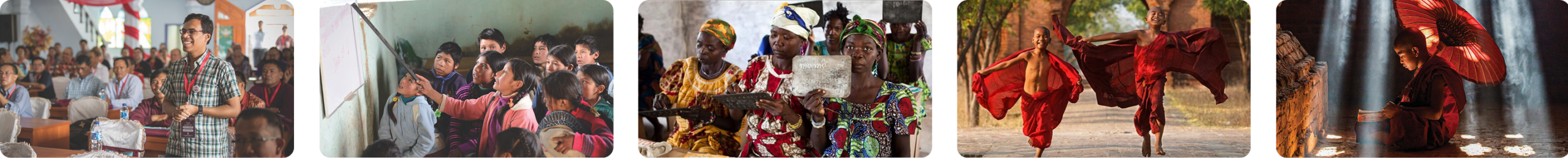
SIL is all about language. So we used language as design—characters as textures, scripts as patterns. We layered in geographic references—latitude/longitude lines, coordinate grids—to anchor their global presence. We created visual connections between communities, cultures, and continents. The brand became what they do: making language visible.
THE COLLABORATIVE PROCESS
Building from the
ground up.
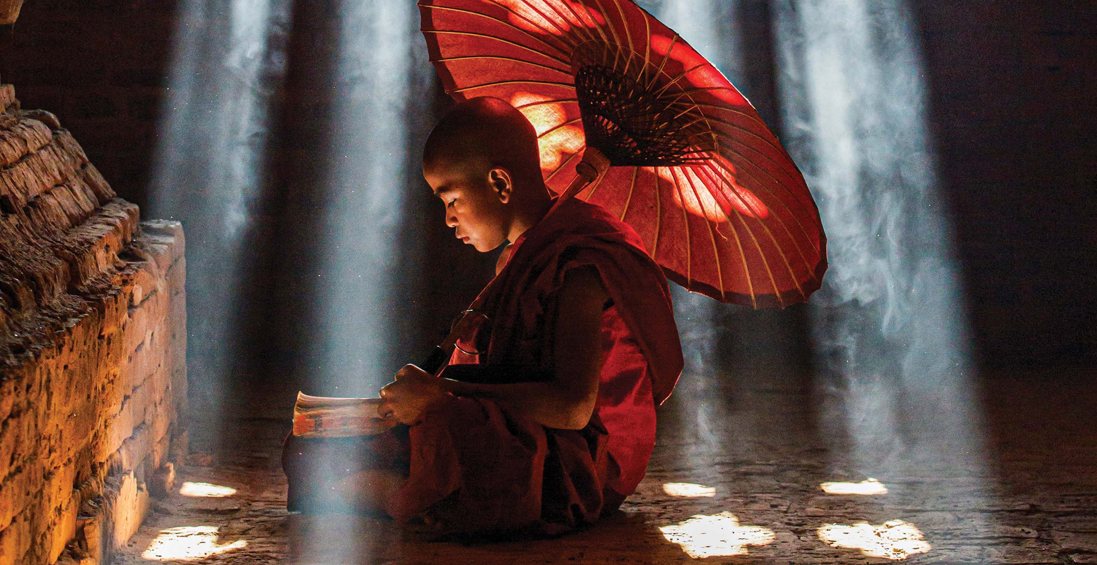
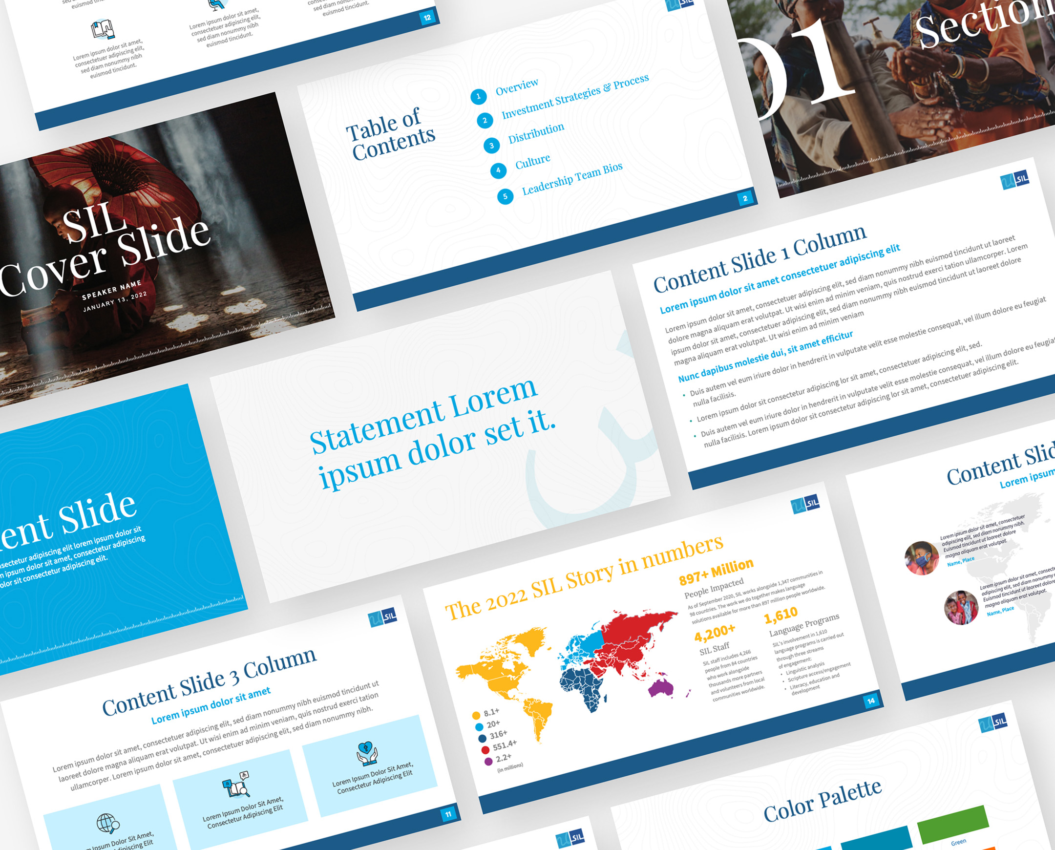
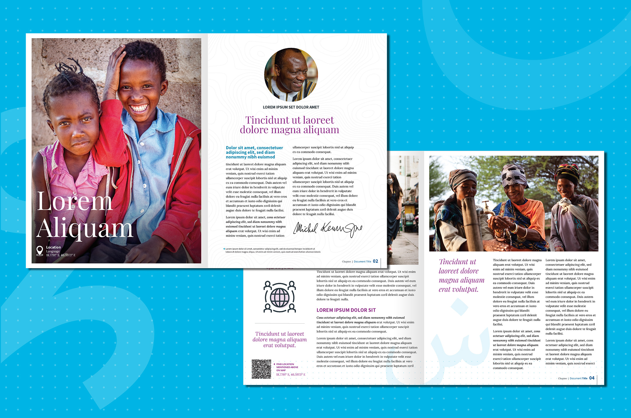
We had a logo and not much else. SIL gave us access to their archive—powerful images, real stories, authentic moments. We studied their work, their reach, their impact. Then we built a complete brand guide that could scale across regions, languages, and cultures without losing what makes them distinct.
THE Impact
A brand system built to last.
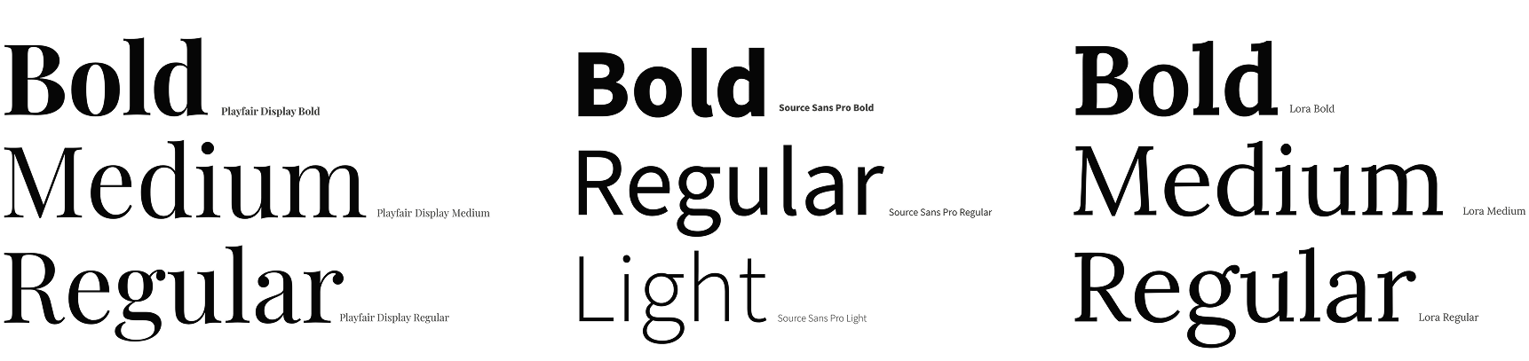
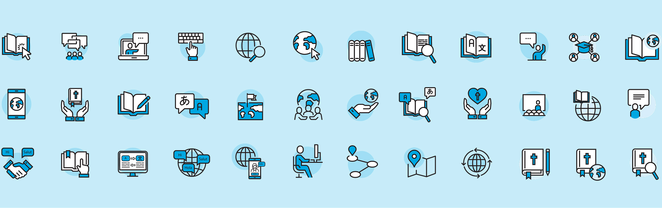
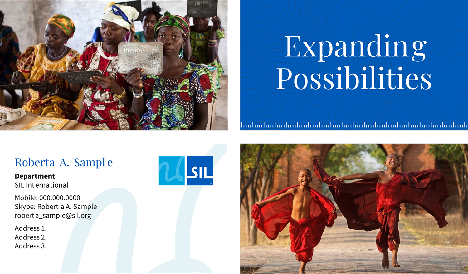
SIL now has a creative backbone. Typography, color, patterns, photography guidelines—everything they need to show up consistently across 119 countries. The brand reflects the scale and significance of their work. And it gives their stories the visual language they’ve always deserved.
No pitch, no pressure. Just a 30-minute conversation to hear what you’re working on and figure out if we’re the right fit. Our founder, Joel answers every inquiry personally — because that’s how we do things, together.